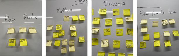
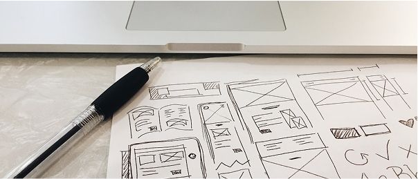
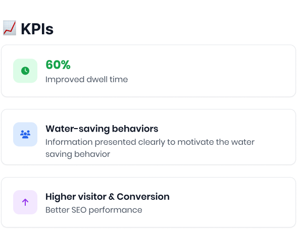
RGX led the UX strategy and discovery, working alongside Ribbon Gang as part of a broader digital transformation initiative. We ran a 90-minute hybrid discovery workshop with 12 cross-functional stakeholders, surfacing key insights, aligning goals, and uncovering experience gaps in the current Water Wrap experience.
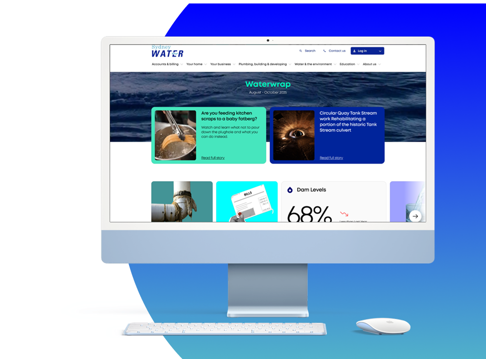
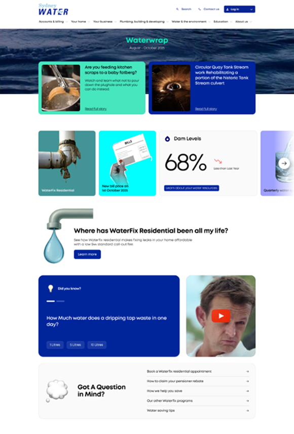
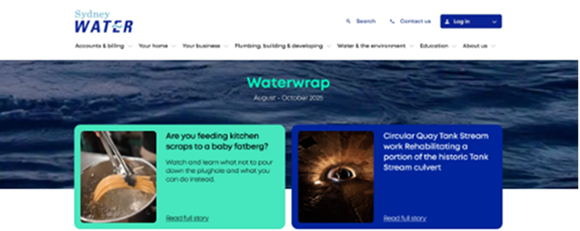
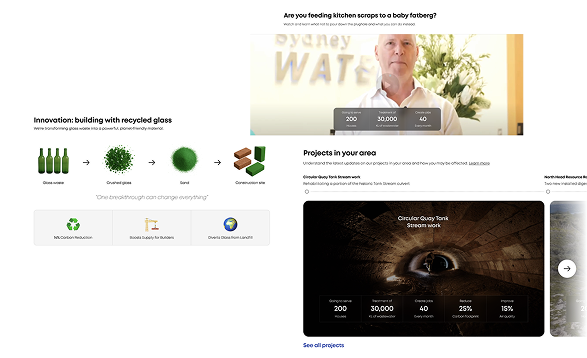
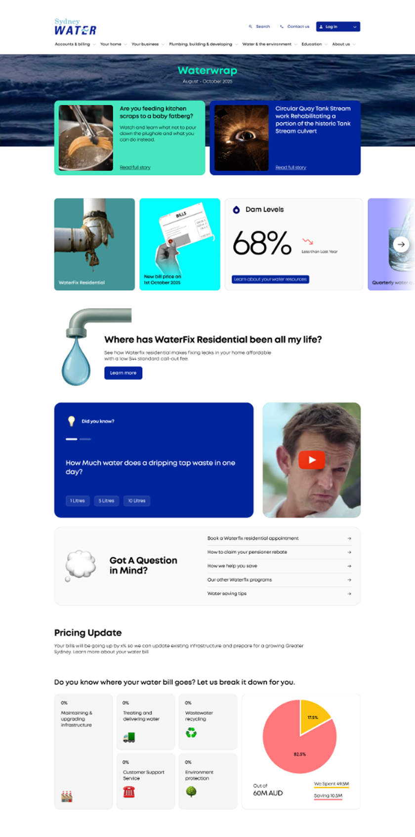
We partnered with Sydney Water to redesign their Water Wrap landing page — leading discovery, UX strategy, and mid-fidelity design to transform a static page into an engaging, user-friendly experience. Our focus: behavioural nudges, interactivity, and a future-ready content model that aligns with both user needs and business goals.